I, Robot opens quietly and the music starts to build up as titles start to appear on the screen. The sounds is like water and consists with the imagery. You see car parts and the opening title of the film is given a purple/red glow which emphasises technology. There are knocking noises which sound as if they are underwater. Bubbles are a common feature.
The volume lowers as "law 1" is put on the screen for the audience to read but the bubbles are still present. The text fades slowly onto the screen and then slowly out again but its dispersed into bubbles. The shot then quickly cuts to an action shot for 1-2 seconds.

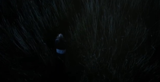
The action shot shows instant panic and characters in trouble. We get the impression two cars are underwater and a little girl and a man are trapped. The bubbles from the text follow a theme. And that the text and action is happening in the same environment. The music has a sharp violin type noise and makes the opening eerie

The action stops suddenly and so does the music. Law 2 comes up on the screen in the same style as law 2. It separates the action into chunks and to add tension because you can't tell to what is going on.

You start to hear space type noises, robotic and technology. The noises get louder and you can make out shouting under water and thudding against the glass. You come into contact with two characters, the characters stuck in the danger. The characters costume implies them to be ordinary people.


The action sequence is sliced again after 3-4 seconds. Each time you cut to a law the action sequence gets longer and the mystery is slowly revealed. The Law transitions creates anticipation because the action is spread out and distorted. Dark colours are constant with the watery effect. Rule of 3: three laws in the opening titles means there is great relevance to the plot-line, to the location.

It then suddenly cuts back to the action and to the shouting under water. This action sequence is longer as a important aspect of the plot-line is revealed. A robot. The smashing of the glass is loud and you hear shouting still underwater. The CGI of the robot is similar to everything else and portrays the title sequence in it sci-fi light. We watch it grab Will Smith but it cuts to black as we watch the hand go over. The title sequence overall portrays a dark eerie atmosphere and builds up tension as the music chops and changes because of the Laws interaction in between.

Analysis: The break up between the action and the text inserts makes the situation tense for the audience and doesn't give away anything of the film. The laws give the audience clue about what is to come, but it doesn't ruin any of the plot but its hints at the laws being of some importance. The general tone of the opening builds up and climax's the audiences interest and the suspense that they are feeling. The sans-serif font is used.
Game of Thrones
The music starts of in a periodic type style. It is a drum beat which stays at a constant upbeat pace. We are greeted first by a dark background with a golden glow in the middle of a sphere looking object. The shot focuses on the sphere for quite a while and shows the metal bands in more detail. You can see engravings which are given a extreme close up. Another thing to note is the font style, it is a medieval and in gold which goes with the ongoing colour scheme of browns, golds, bronze and beige.


The violins gets louder as more imagery is shown. There is clapping along with the drum beat. Clock parts and machine part (Steam punk) like object sprout from the map to recreate medieval towns and/or cities. The camera then weaves through the city at a comfortable speed with the music. It travels like its a bird across the map and stops at important landmarks which suggests they are an important part


The camera zooms and twists across wooden map in a fast motion. Similar to before and goes over important places which will probably be featured in the plot line. The title sequence is setting the scene and background.
.jpg)

Analysis: The opening title sequence entices the audience from its intriguing animation and the choice of music which fits in. The font with with golden glow gives the audience the impression of magic and wonder, and is very effective. The imagery hiders to the audience it is medieval (the genre of the thriller). The map is a kingdom, therefore the opening titles are setting the scene for the audience so they understand that 'Game of Thrones' is filmed over a vast area (a kingdom). It suggests that the 'kingdom' is a big part of the series plot line.
Girl with the Dragon Tattoo
The music starts of in a periodic type style. It is a drum beat which stays at a constant upbeat pace. We are greeted first by a dark background with a golden glow in the middle of a sphere looking object. The shot focuses on the sphere for quite a while and shows the metal bands in more detail. You can see engravings which are given a extreme close up. Another thing to note is the font style, it is a medieval and in gold which goes with the ongoing colour scheme of browns, golds, bronze and beige.

The music changes slightly with a tinned guitar riff to speed up the music as the opening titles speed up. There is a special effect like a microscope as it zooms in on Kings Landing. Every time you look through the microscope you cut closer and closer to the settlement. The transition as it gets closer is smooth and move relevant to the object.


We cut then to the sphere again and the symbol is show clearly to us in a extreme shot. This means this is important to the Game of Thrones. Could suggest royalty? Due to the extreme close ups and referral the engravings suggest importance. There is a sword/black smith sound effect to emphasise the flames/fire.

.jpg)
The music reaches a fast tempo until the title comes up on the screen in a slow zoom out of the metal bands again (showing the engravings). The sword contact sound pierces your ear drum as the title stops on the screen. The music stops as it cuts to black. Has a fantasy persona.

Analysis: The opening title sequence entices the audience from its intriguing animation and the choice of music which fits in. The font with with golden glow gives the audience the impression of magic and wonder, and is very effective. The imagery hiders to the audience it is medieval (the genre of the thriller). The map is a kingdom, therefore the opening titles are setting the scene for the audience so they understand that 'Game of Thrones' is filmed over a vast area (a kingdom). It suggests that the 'kingdom' is a big part of the series plot line.
Girl with the Dragon Tattoo
The music is fast and upbeat. The shot cut along with the beat putting your heart on the edge. The images revolve around black water or black oil. The transistions between shots are violent.


The shots become linked with the film titles as the black oil gushes over the sketchy text. It makes it look restless and rebelious. It stays with the black shiney colour scheme. The music at this point is loud and reaches the vocals.

Electrical appilances have their own mind and twine in the air. Black is a huge conponent in the imagery background. The text of the credit in the sequence is contrasted against the background and is a quick 2 seconds on screen then off screen. Fire is then brought in and a match is falling into a eye. The fire and the blackness contrast but still has dark colour scheme despite the vivd contrast.


The extreme close up on the high is very dramatic and the CGI of the flames consuming the eye is amazing. It then cuts to the whole body catching in fire and burning. Despite the random semiology its set a mood and tone of what the film is going to be like, especially with the music. We get the impression its got some sort of psychological action genre about it aswell as it being a thriller.


We get to look at the characters but with the same theme they are made of oil. We can see particular features which we wouldn't nesscaryily see. She is centred in the head shot so we are to focus on her and her alone. There is nothing in the background but she doesn't stand out due to the dark background, she blends in.

More absurd effects are used on the fire. A phoneix rises. It's put into slow motion so you can observe the way the bird is flapping its wings for dramatic effect and its fits in with the music which is making your heart race from adrenaline.

Bugs then come out of the characters eyes just before they come out of her mouth. There is no fire which could suggest the subjects on fire could be symbolic. As it is a psychological it could have a hidden meaning behind the things that are on fire and stand out. The shots are still very short and choppy.


The music stays at its constant heavy going speed and tempo. There is more emphasis on Daniel Craigs character, who is bound and wound. It shows in more detail the idea of the oil and the action/drama in the film to come. The obscurity must be linked to the film.

It ends with the "girl with the dragon tattoo" (I assume) opening her mouth and the camera going in before cutting to black. The effect the camera gives the impression we could be at a point of view of one of the bugs or that she is swallowing us because she has power. The music comes to a sudden stop and goes black.

Analysis: To the audience, the opening sequence would be seen as confusing. It's makes your heart race and grips you to the beginning due to the sharp transitions to different shots and the timing it has with the dramatic increase in tempo. The black and the fire could be symbolic. The fire being symbolic such as the phoenix which is a symbol of fire. When the fire goes into her eyes and the whole body is blown up into flames could be symbol of corruption and/or the mentality of a character in the film. The surrealism gives you the impression it messes with your mind as well as the action side, which the audience would of got from the opening. The use of black suggests the darkness of the story, dark events occur in the film and the tied up and gagging portrays the violence and sexual assault.